Footer
The footer is displayed at the bottom of every page. It is divided into two areas: a top area for content blocks, link columns, and an optional newsletter signup, and a bottom bar for payment icons, localization selectors, and copyright information.
Content blocks
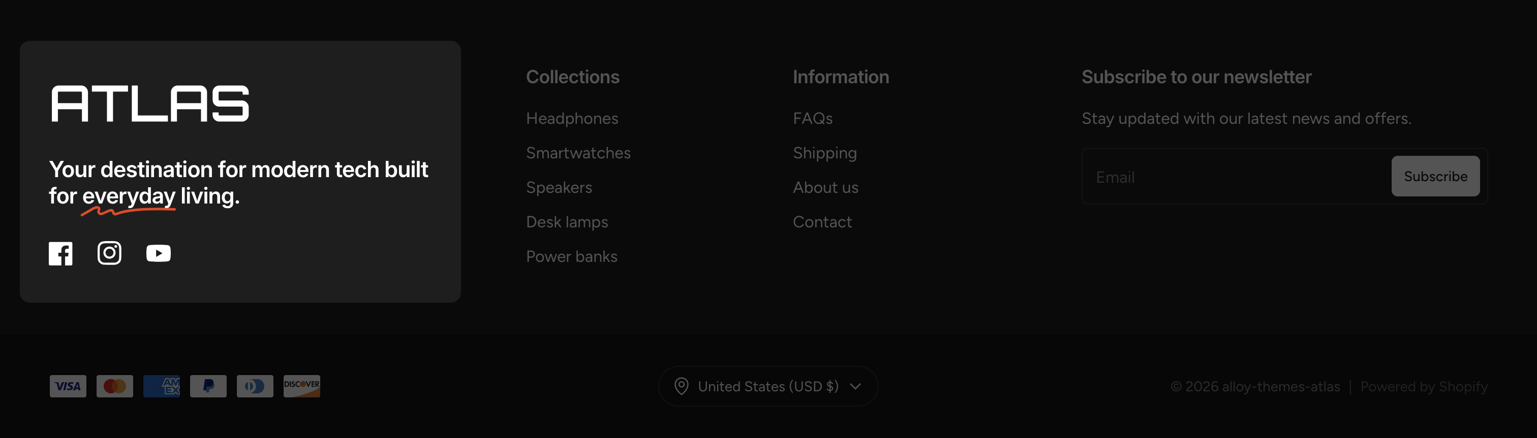
Content blocks let you add rich, flexible content to the footer — such as an "About us" blurb, your store logo, social media links, or any combination of inner blocks.
Add a Content block
- Open the Theme Editor and find the Footer section.
- Click Add block and select Content.
Add inner blocks
- Inside the Content block, click Add block.
- Choose from the available block types — for example Heading, Paragraph, Social icons, Image, Button, or Email signup.
- Arrange and configure each inner block as needed.
Each Content block supports Text alignment settings for both desktop and mobile, so you can align the content independently on each screen size.
Enable Follow on Shop to display a follow button that lets customers follow your store through the Shop app.
Link columns
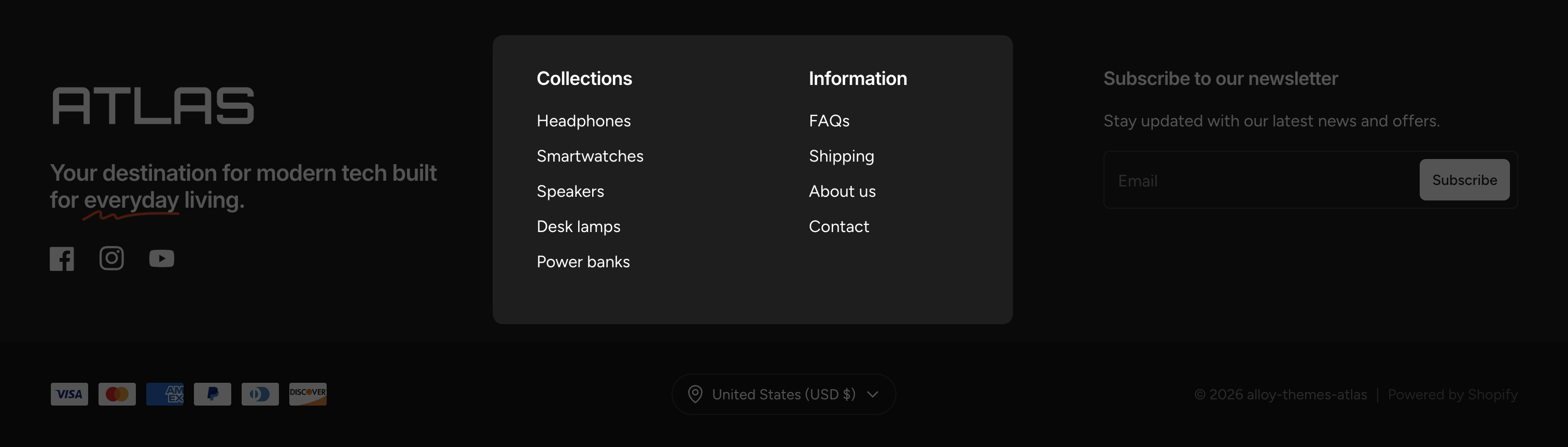
Link columns display navigation menus in the footer, giving customers quick access to important pages like your policies, FAQ, or product categories.
Add a Links block
- In the Theme Editor, locate the Footer section.
- Click Add block and select Links.
Configure the link column
- Choose a Menu from your store's navigation menus.
- The Heading defaults to the menu title. To use a custom heading, enable Show heading and enter your own text.
You can add multiple Links blocks to create several columns of links side by side.
Collapsible links on mobile
By default, Collapse links on mobile is enabled in the footer section settings. This turns each link column into an accordion on small screens — customers tap the heading to expand or collapse the list. Disable this setting if you prefer the links to always be visible.
Newsletter signup
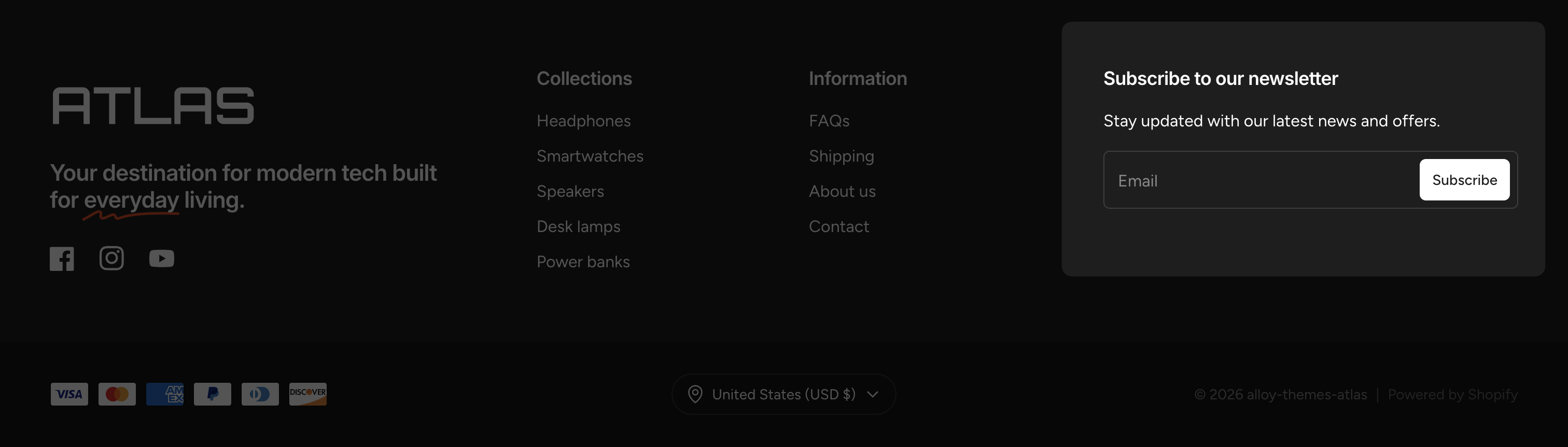
The footer includes a built-in newsletter signup form. When enabled, it displays a heading, optional descriptive text, and an email input field.
To configure the newsletter signup, select the Footer section in the Theme Editor and adjust the following settings:
- Enable email signup — toggles the newsletter area on or off.
- Heading — the heading displayed above the form (e.g., "Subscribe to our newsletter").
- Text — a short description shown below the heading.
- Button style — the style of the subscribe button. Options: Primary, Secondary, White, or Black.
When a customer submits their email, they are added as a subscriber in your Shopify admin under Customers.
Bottom bar
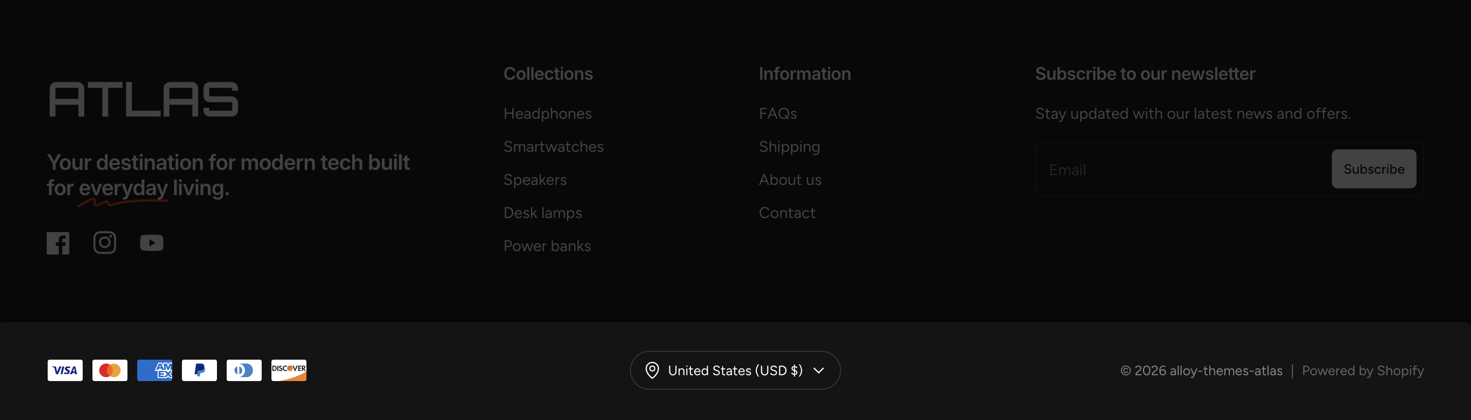
The bottom bar sits below the main footer content and contains:
- Payment icons — displays the payment methods your store accepts. Enable or disable with the Show payment icons setting. The icons are determined automatically based on your store's payment configuration.
- Country selector — lets customers choose their country. Toggle it with the Show country selector setting. Only appears when your store has multiple countries configured.
- Language selector — lets customers choose their language. Toggle it with the Show language selector setting. Only appears when your store has multiple languages configured.
- Copyright — automatically displays the current year and your store name.
Colors
- Background / Text / Heading — the colors for the main footer area.
- Bottom bar background — a separate background color for the bottom bar. When left empty, it uses the same background as the rest of the footer.
Spacing
Enable Custom spacing to manually control the top and bottom padding of the footer section.