Section structure
Sections are the building blocks of every page in the Atlas theme. Each section follows a consistent structure, and most share the same library of reusable content blocks. This guide explains how sections are organized and how to use blocks to build your content.
Section structure
Using the Collection list section as an example, the hierarchy is organized as follows:
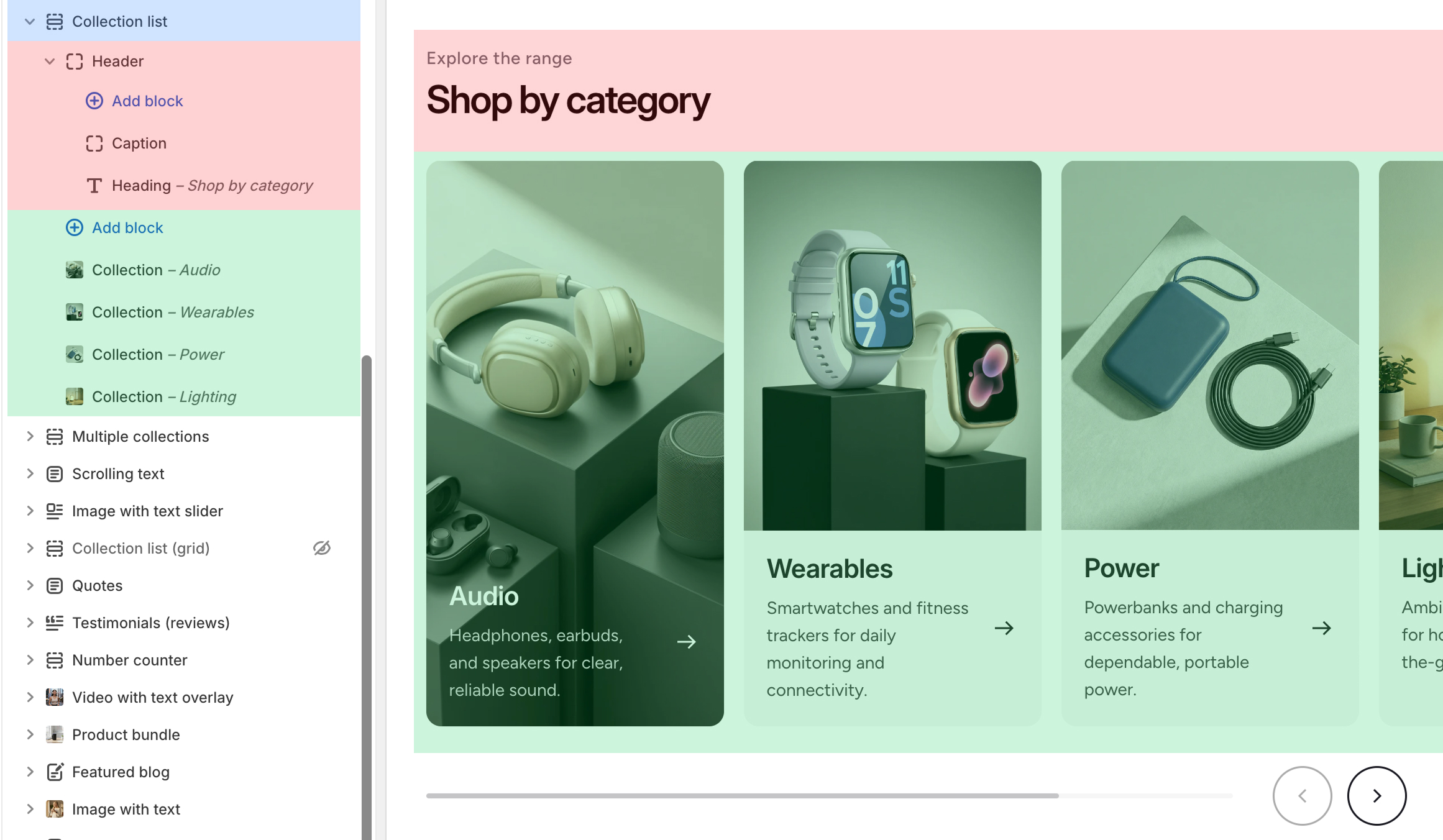
- Section (blue) — the outermost container. Select it to access section settings.
- Header (red) — many sections include a dedicated header group. Add or edit theme blocks here to customize the section's heading area.
- Content (green) — the primary content area. In the Collection list example, these are the individual collections to display. In content-focused sections like Rich text or Image with text, you can add and arrange theme blocks such as Heading, Paragraph, and Button to compose your layout.
Theme blocks
The Atlas theme provides a set of theme blocks — reusable content components shared across sections. A Heading block, for example, works the same way regardless of which section it appears in.
The following blocks are available:
- Button
- Button group
- Caption
- Countdown timer
- Counter
- Custom Liquid
- Custom spacing
- Discount code button
- Email signup
- Heading
- Icon
- Image
- Logo
- Multicolumn
- Paragraph
- Rating
- Social icons
- Text with icons
- Video
Each block has its own settings for fine-grained control. For example, the Heading block lets you configure the Heading size, Color, and SEO tag.
The following example shows a Rich text section populated with various theme blocks:
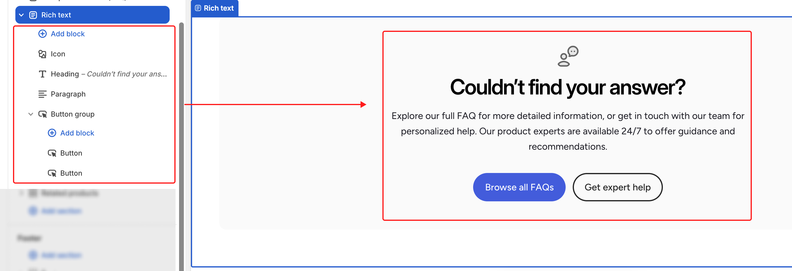
Nested blocks
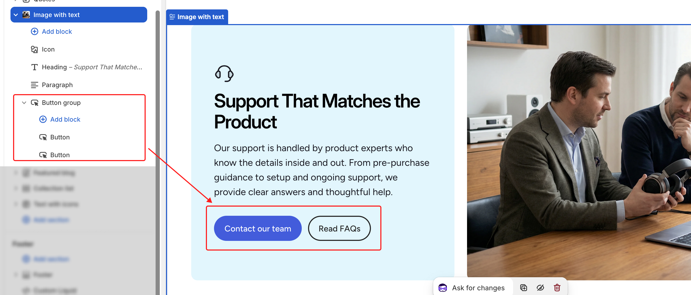
Some blocks support nesting, letting you group related elements into a single unit. For example, the Button group block can contain multiple Button blocks, so you can display several buttons side by side in one row.