Theme features
Newsletter popup
Grow your email list with a customizable popup that invites visitors to subscribe.
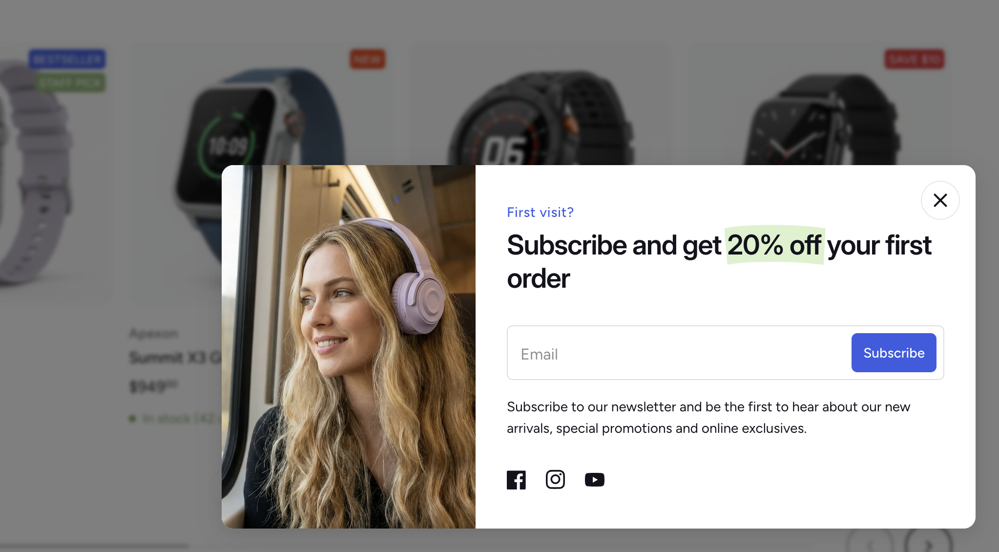
The newsletter popup is an overlay that appears after a short delay, encouraging visitors to subscribe to your mailing list. You can customize when it shows, how it looks, and where it appears on the screen.
Getting started
Enable the Newsletter popup section
- In the Theme Editor, find the Newsletter popup section in the Overlay group. This section is hidden by default — click the visibility toggle () next to it to turn it on.
Edit the content
- Click into the existing blocks to update the heading, message text, or any other details to match your brand.
If you need to customize the popup further, you can add, remove, or rearrange blocks — the popup uses theme blocks, so the same block types available in other sections (such as Heading, Paragraph, Social icons, Image, and more) are available here too.
Section settings
Display rules
These settings control when and where the popup appears.
- Show on home page only — when enabled (default), the popup only appears on the home page. Disable this to show it on every page.
- Do not show for logged in users — when enabled (default), the popup is hidden for customers who are signed in, since they are likely already subscribed.
- Delay — the number of seconds a visitor must be on the page before the popup appears. Range: 3–60 seconds (default: 3).
- Frequency — the number of days before a dismissed popup reappears for the same visitor. Range: 1–60 days (default: 30). For example, if set to 30, a visitor who closes the popup won't see it again for 30 days.
Image
You can add an image to the popup to make it more visually engaging — for example, a product photo or lifestyle image.
- Image — the main image displayed alongside the popup content.
- Show image on mobile — by default, the image is hidden on mobile to save space. Enable this to display it on small screens as well.
- Image (mobile) — an optional separate image for mobile devices, which only appears when Show image on mobile is enabled. If left empty, the main image is used.
Layout
- Image width — controls the width of the image area (180–320 px). This setting only appears when an image is selected.
- Position — where the popup appears on screen. Options: Left, Center, or Right (default: Right).
- Text alignment — controls the alignment of text and blocks inside the popup.
- Blur background — when enabled (default), the page behind the popup is blurred, drawing focus to the popup content.
Colors
- Background — the background color of the popup.
- Text — the text color inside the popup.